
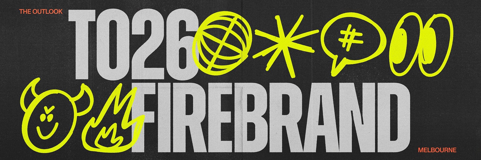
SYDNEY, Australia — July 13, 2026 — When Design Outlook approached global creative company BUCK to brand its 2026 annual conference, the brief came with a formidable theme: ‘Firebrand’. Among standard corporate tech events dominated by polished graphics and bright colours, the easy route would lean into visual metaphors of heat and innovation.
But the design industry is currently navigating an unprecedented wave of angst. Between the rapid rise of generative AI, widespread industry burnout, and a sense of digital loneliness, BUCK recognised that the community didn’t need another comforting corporate hug. Instead, they tapped directly into the collective anxiety, friction, and debate shaping the discipline—creating an identity that functions like a cultural statement.
Rather than smoothing over the industry’s cracks, the team leaned into them. BUCK Lead Strategist, Lucy Gavan, notes that, with content becoming easier to automate, human judgment and a distinct point of view have become the ultimate premium.
“We saw a tension emerging between those willing to follow the pace of change and those who actively shape it,” Lucy said. “The insight was that meaningful progress rarely comes from consensus. It comes from people who challenge assumptions and raise standards. As a result, we made Firebrand synonymous with deliberate agitation.”
Firebrand is a movement designed explicitly for the agitators—appealing to those who use productive rebellion and friction to spark better outcomes. To capture this spirit of deliberate agitation, BUCK’s creative team had to completely rethink their execution, intentionally leaving a more traditional, safe direction on the cutting room floor.
“During our brand territory explorations, we developed a concept centred around fire as a regenerative force,” said BUCK Art Director Malisa Perona. “It ultimately lacked a sense of rawness: the untamed energy, grit, and instinctive edge that feels intrinsic to the brand.”
To find that edge, BUCK had to physically step away from their screens and embrace a chaotic, analogue process.
“Malisa and I forced ourselves to go a bit analogue. We used collage, put pen to paper, and refamiliarised ourselves with the scanner for the first time since our uni days to try and generate visual ideas that were truly, authentically DIY,” BUCK Art Director, Liz Smith said.
The resulting visual identity balances tension, pitting unpolished human instinct against structured digital reality. The system thrives on a contrast between rigid typography and erratic, hand-drawn elements. This is central to BUCK’s outlook on the future of design, reflecting a shared vision that celebrates human craft—where imperfection is a feature, not a flaw.
“For me, the iconography developed for the brand is what truly drives the emotional side of the visual identity,” said Malisa. “It captures the sense of playfulness at the heart of the brand through irregular, organic linework that feels instinctive and unpolished. The loose, expressive mark-making creates a compelling contrast with the more structured typography, giving visual form to the tension between rawness and refinement.”
Scaling this raw energy from physical desk scraps into a comprehensive digital and print rollout for the 2026 conference required a delicate touch. The grit of the scanner and the unpredictability of pen-on-paper were carefully adapted to frame the conference’s core pillars: design, product, leadership, and AI.
“The Outlook’s audience is quite exhausted with content, blandness, and this sort of race to sameness,” Grant Show, Executive Producer & Founder of The Outlook, said. “What’s resulted from this rebrand is our confidence and self-identity is now matched by a brand that is unique, has an edge, and is unapologetic in its execution. Imperfect and hand-made.”
By treating the identity as a lightning rod for contemporary industry anxieties, BUCK has proven that a brand doesn't need to please everyone to be powerful. By embracing the friction of our current cultural moment, they’ve built a visual home for the rebels who will shape what comes next.
See more of the work at https://buck.co/work/the-outlook-firebrand.